Case study:
Context and challenge
Acorn Aluminium is a leading supplier of aluminium façade and curtain walling systems to the commercial specification sector. While it has an established reputation for service and quality, its’ brand identity had lost currency and its website also required redevelopment.
Lasco was appointed to create a new brand identity, which would resonate with commercial and architectural audiences and apply it to a new website.
Our challenge was to develop a design route which while referencing Acorn’s name and business area, avoided potential cliches and cul-de-sacs.
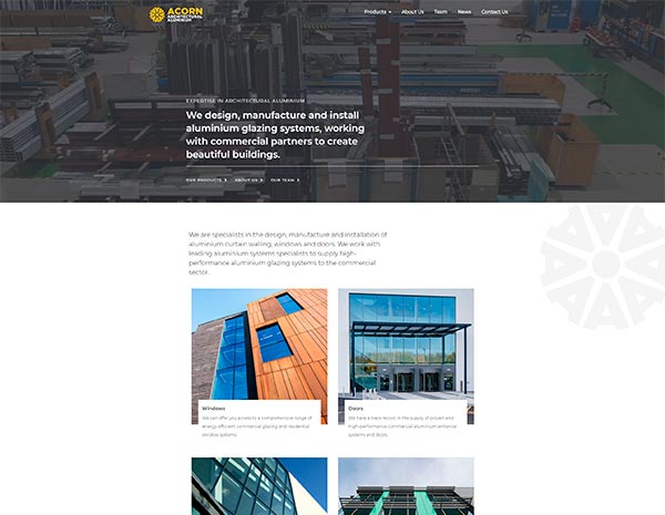
The second element was to apply this to the design of a new website, to better reflect Acorn’s value proposition and how it works.
”We could see the problem, our logo was tired and our website was out of date, but it’s one thing to identify the challenge, it’s another to see the way out. The team’s understanding of our market audiences meant that Lasco was able to translate the vision we have for our business, into a brand and website that reflects it
John Spiby,Divisional Director, Acorn Aluminium
Our approach
As part of our strategy we invested time in understanding Acorn Aluminium’s value proposition and how it wanted to be seen. We then conducted a competitor analysis as well as researching its customer base to understand how it saw itself.
This gave us the foundation for the brief into our design team, including the visual references and design principles applied by Acorn Aluminium customers and prospects, to their own visual identities.
Brand identity basics:
Our solution
We, and Acorn, wanted to avoid cliches but still reflect its name and the sectors it works in in the development of its new logo, creating four options and showcasing them in different colour palettes.
This included wordmark designs, where the written name of the business or organisation is dominant, and pictorial marks where a symbol defines the design.
We also applied them to an illustrative website design, demonstrating how they would look online, including different colour combinations.
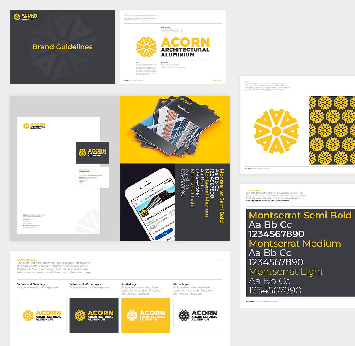
In the end, Acorn decided on a contemporary pictorial mark. This was formed by a repeated letter ‘A’, to form an abstract representation of an acorn cupule from above. The design also has architectural and mechanical/manufacturing elements, embodying Acorn’s name, what it does and the markets it serves.
As part of this exercise, we also created brand guidelines, defining a new colour palette and social media uniform.
These provided a foundation for our digital team, which moved the design principles forward, evoking architectural elements and mechanisms in the layout of the site and content platforms.
The client’s assessment
“We have some big plans for the future. The exercise with Lasco and the development of our identity and our website has reinforced that, giving us an identity and new website, that positions us a forward-looking business, and which represents who we are and where we are going very effectively.”
John Spiby,Divisional Director, Acorn Aluminium
Our work
We’re extremely proud of the work we do. These are some of our recent projects.