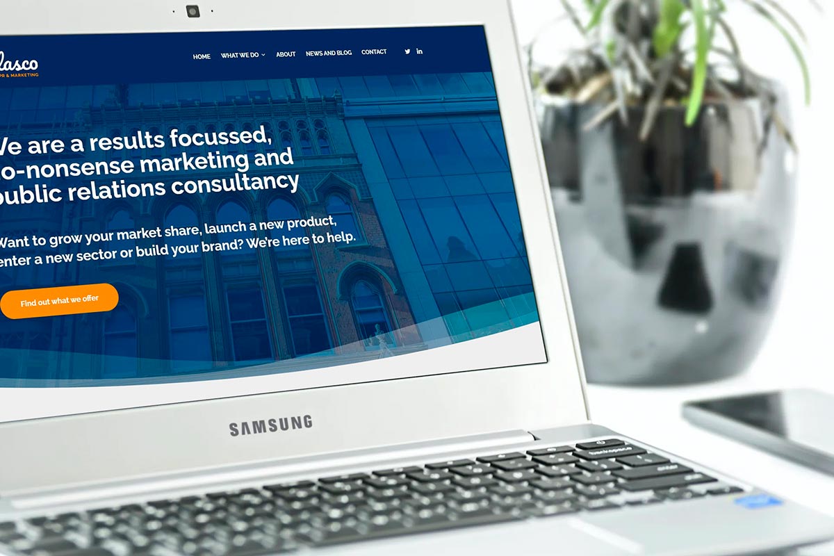
You paid a designer to build you a new website. It looks great. It works well on mobile devices, has some big banner images, a video promoting your latest product on your home page, a feed of your latest Twitter activity and all the information your customers told you they wanted.
You think you’ve got an excellent website which really showcases your business and products and is a solid foundation for your marketing strategy. But what if, despite the responsive design and high quality embedded video, your website was actually harming your business?
While it’s good to keep your aesthetics fresh and your content sharp, you’ll cause lasting damage by ignoring the most important thing about your website – its usability.
Five simple usability principles websites often forget
It should be obvious what the website is for
Any visitor to your website should be able to work out what your business is within milliseconds of arriving. This may sound obvious, but if your logo doesn’t explicitly state the nature of your offering, the first quarter of your home page is taken up with a stylised generic image and your main menus (also called navigation) are labelled with the names of obscure-sounding products, how do we know what you do and why we should stay?
If visitors need to apply effort to understand what you do, you’re off to a bad start. Usability expert, Steve Krug, sums this up nicely in his book ‘Don’t Make Me Think’:
“Making every page or screen self-evident is like having good lighting in a store: it just makes everything seem better”
Don’t listen to your users
We always encourage our clients to make sure their website developments are based on insight gained through research with real users. Nothing gives you a better understanding of how your website performs like testing.
The key here is not just to listen to what your users tell you, but to watch what they do. While research is useful to gain a better understanding of why people come to your site, they often find it harder to describe their experience once they got there.
It’s only by actually watching them try to perform key tasks and observing what they find easy and where they get stuck, that you’ll really be able to tell if they can successfully find what they’re looking for.
Observational testing like this is not just for development phases either. Your website will be changing all the time as new content is added, or structures and layouts are tweaked. We recommend regular testing to identify obvious problems and help you prioritise future developments.
Navigation, navigation, navigation
Helping your visitors to find their way around a website without requiring any effort should be your primary goal. When it comes to conversations about hierarchy of content (which bits are most important) and how to organise them, make sure your decisions are made based on what you know about the needs of users, not what your own team thinks.
There are plenty of free survey tools out there that you can use to capture the experiences and needs of your website visitors, and hopefully you’ll already have plenty of data at your fingertips from your analytics tool. Find out what most people are looking for and make that the easiest thing to find (you can check if your designs are successful through testing!).
Make sure you design your site for all types of users too: some people always head for the search bar, while others prefer to browse for what they’re looking for. Your search function should be easy to find and available from anywhere on your site.
Website users also always like to know where they are, and to be able to bail out at any time and head back to the home page, so help orientate your users with a breadcrumb trail and an easily visible home button.
Use fewer words – and make them better
When it comes to website content, less is most definitely more. Being faced with a lengthy product description of any kind is highly off putting and likely to send your users heading for the hills.
Content writing is a skill, so make sure anything you write for your website is checked for usefulness, consistent tone of voice and relevance before being published.
Check your analytics to see how long users spend on product pages. If a page has 1,000 words but visitors only stay for three seconds, you can be pretty sure your copy could be better.
Avoid dark patterns
A dark pattern is a deliberate use of a tool, technique or design which tricks a user into doing something they don’t want to on a website, usually to generate income.
There are lots of examples of these – the invisible ‘unsubscribe’ box, forced continuity (making users subscribe to a free trial then charging them when the trial period ends without notification) or unintended sign up to a newsletter.
None of us like to feel conned into spending money, and while they may generate additional revenue in the short term, in the long run dark patterns will always harm your business.
As well as putting yourself up for being shamed on social media (see #darkpatterns Hall of Shame), you’re leaving yourself open to competition from a less shady operator willing to attract custom through good user experiences and ethical design.
To find out more please email info@lascoprandmarketing.co.uk

